We released a new chart that lets you add any factors & formulas. Should be a great tool to visualize your formulas, and researching stocks. You can see them from STOCK->POINT-IN-TIME CHART . We’ve pre-built some templates which you can access via the drop-down. You can also save your own.
At the moment you can only chart a single company and either show each metric in it’s own chart, or group them together in one chart. Future enhancements include the ability to add multiple tickers and create groups of factors.
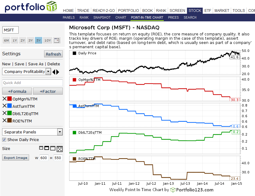
Below please see an example of the ‘Company Profitability’ template for Microsoft for the past 5 years.
Great work Marco!
I just saw that GOOG is not showing EBITDATTM recently, is there an error, perhaps caused by the 2 share split?
Also, some strange spikes in EBITDATTM in CRM
The daily stock price chart is visible by default. Assuming you choose to leave it that way, you’d be starting with an assumption that higher-is-better.
As we all know, that’s not the case with many factors and formulas in which we are interested; valuation metrics, analyst ratings, etc. With ranking systems, we address this pretty much in a split second through the default arrow pointers with factors, or obvious click-in-an instant choices we make with the formulas we build. With charts, we have to give the matter more thought.
You can take things as they come and separately adjust to higher-or-lower is better for each of the charts you create (with or without a formula label that reminds you). Or, you can make your own transformation wherever necessary to depict each chart of a bigger is better basis. Check the pre-set Portfolio123 chart templates. I created several such as to spotlight the need to consider and address this set of choices.
Remember, too, that these charts, while they can be as simple as anything out there, can also be quite sophisticated. You have, at your disposal, the full library of p123 factors, functions, and of course, all the formulas you can create based on them.
As for me on Chrome predefined chart selection from pull-down menu just do nothing but refresh current view. Nevertheless I can change ticker, dates, manually change factors etc.
Not sure why Compustat is making the line items N/A for GOOG. CapitalIQ (also part of S&P) seems to have them but they have a less stringent methodology for standardization. We’re inquiring with S&P.
For CRM the spikes had to do with our fallback mechanism for EBITDA during preliminary reporting. CRM’s EBITDA is N/A, so we try to build it using EBIT and Dep&Amort. For some reason CRM reports a very different Dep&Amort in the cashflow vs the income statement , causing these temporary spikes.
For CRM the only choice we have is to fallback to previous quarters and ignore the cashflow data.
We are going to tweak our fallback mechanism to address this.