Recently I made a post "What’s been working recently showing that one of the best performing factors recently has been “EBITDAQ/CurLiabQ”. In the rest of the time, it has been a positive but overall mediocre factor.
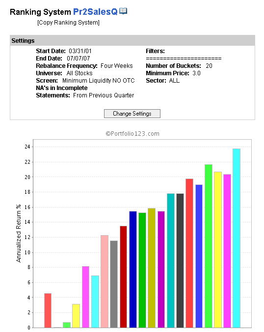
Until about a year ago, one of the strongest factors was the price/sales ratio, known as Pr2SalesQ (most recent quarter). I have attatched a graph showing the performance of ranking this single factor by itself up until 07/07/07, about a year ago and about coincident with the top of the market, before the credit crunch “troubles” set in. I use my minimum liquidity screen in all ranking tests to exclude un-tradeable stocks.
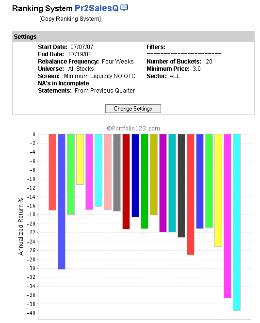
I have also attatched a graph showing the performance of the same factor in the period 07/07/07 to date. The most striking feature is that the alpha effect has completely reversed! It is hard to believe one is looking at the same factor, but it is true.
I have called this phenomenon “factor reversal”, because the factor, previously thought to improve results actually makes them worse. This is worse than simply “not working” anymore.
I think factor reversal should be a key concern among p123 users. I am not sure exactly what to do to mitigate it, but I think there are several implications worth investigating
-Factors that have worked very well for a long period of time may be “overbought” and due for a reversal
-Conversely factors that have added little value (such as EBITDA/CutLiab) may be much better in real time
-Optimisation should be viewed with great caution. All optimisation processes would have heavily weighted the Pr2Sales factor, and as result provide poor results in real time. This has happened with the once popular “TF12” ranking system
-Diversification of factors. Just as a single stock should not exceed a certain weight, perhaps the same should be true of factors:- no one factor should dominate a ranking system
-Diversifcation of ranking systems - something that Denny advocates
Furthermore, I wonder if there is a way to forcast when the risk of a factor reversal becomes high. For example, it would be nice to chart the progress of the dispersion of the factor quantities. In the example of Pr2Sales, one may find that the range of values has narrowed in recent years - low PSR stocks have re-rated up, and high PSR stocks have re-rated down. Graphically, it would be possible to see that this could not continue indefinately if this were indeed a secular trend. Perhaps valuation compression could give a warning signal that factors are about to fail/reverse. I may make this a feature request if I can explain it better.
So, any thoughts on what we can do about factor reversals?
I’ve offered alternative interpretations before in terms of market specifics. In particular, I’ve noted that a low P/S ratio is defensive when shares are declining because of valuation concerns and it is risk when shares are declining due to rising input costs. And I also pointed out that favoring “EBITDAQ/CurLiabQ” in the recent period caused one to favor energy stocks and avoid financial stocks during a period when energy was generally doing well and financials were generally doing poorly.
Oliver seems to me to be a super smart guy, and because the viewpoints above didn’t even make it into his latest list of possibilities, I want to make the point a different way by connecting it with a general statistical phenomena known as “Simpsons Paradox” - http://en.wikipedia.org/wiki/Simpson’s_paradox
This basic form of the paradox occurs in situations where in a composite group, Factor A is positively correlated with Result B, but if we split the composite group into sub-groups, Factor A is negatively correlated with B in each sub-group. When first confronted with examples, people go “Huh? How can that be?” The explanation is that Factor A is also associated with a selection bias towards different sub-groups that have different base rates of result B, and sometimes the combination of selection bias and base rates reverses the underlying correlation relationship.
In the case stocks, we can think of the sub-groups as different industries and the valuation measure as Factor A. The point is that even if it were the case that Factor A had a positive predictive effect on performance within each industry sub-group, it could still have a negative effect on overall portfolio performance by favoring industries with a lower base rate performance in a give period.
I’m not saying that Simpson’s paradox is necessarily a better explanation for the phenomena Oliver is considering than the one’s he mentions, but it definitely merits closer inspection.
Another good example is price/book. For long P/B has been a factor identifying good value stocks. Lately however, low P/B companies have been hammered. Why? Because most financial companies have an inherently low P/B.
I believe this phenomena is even more powerful that what research explain because of investing momentum. When P/S-based models start suffering, traders fly away from those models and that in turn produce more negative momentum. That continues until market participants realize the move is overextended and downside risk is limited.
Call it factor-based momentum: different data-point, same human nature.
Hi,
Interesting discussion. Maybe I’m oversimplifying but P/S, and P/B may not be working because they favored a sector that has been out of favor. Wonder how they have been working among the strong sectors, or the market minus financials.
‘Factor momentum’ is an interesting idea, seems quite plausible, given the number of technical factor-based funds around.
I suppose the simple answer would be to compare with older data when the extended data set becomes available. If P/S gave stunning alpha the last 3 years, but only average results for the 5 years before this, then perhaps it is due for a correction. THere are of course many other things which could come into play to affect the result, as others have pointed out (industry/sector focus, market cycle).
I guess to be robust, one should use many factors, but only factors that ‘should’ work from a common sense point of view, and not fine-tune too aggressively over short timescales.
“Simpson’s Paradox” is certainly an interesting idea. I am not sure if it is directly applicable here, but it does bring up the issue of “hidden variables” such as was suggested by the example on wiki about the men/women admittence rate. Intiially it looks like women are discriminated against, however, with more analysis one realises that women apply for more competative courses (that have lower admission rates in general). This is the “hidden variable”.
To my mind, a “hidden variable” could be the “true” value of a company as measured by the cashflow discount model. Perhaps this is the reason why “value” has outperformed, because they have been “truely” undervalued. However, there is definately an equilibrium level at which value will no longer outperform (may underperform) because the valuation discount correctly reflects inferior growth prospects.
As for sectors being in and out of favour - this is like a chicken and egg situation. Do the factors cause the sectors to be in or out of favour, or vice versa? In any event, the proof of the pudding is making money.
I believe that S&P ranking systems allows for dynamic re-wieighting of the factors. This sounds quite interesting, though I am not sure whether there is factor momentum or factor reversal. However, based on my own monitoring I would say momentum is more likely, that is, at least over the short term, factors that have done well are likely to continue doing well in the near term.
I indicated one example of a “hidden factor” above: the industry/sector of the stock. More explicitly, the following situation is possible: within each industry group, at all times, value factor F is positively correlated with stock performance, but in a portfolio construction context, factor F is positively correlated with performance in time period T1 and negatively correlated in time period T2, because in T1 it favors industry groups that perform relatively well and in T2 it favors industry groups that perform relatively poorly. The industry groups it favors in T1 and T2 can be the same or different - the example can work either way. This is essentially the same structure as the Berkeley admission example. There, the factor is gender, the measured variable is success/failure of admission applications, and department applied to plays the same role as industry group. Women were doing badly there because they tended to apply to depts. with more competitive admissions. In any period a value factor can do poorly because it tends to select industry groups that do poorly in that period for fundamental reasons (or the perception of such).
These are great points you all bring up. As a buy side shop we have had to deal with these issues but have had to rely more on experimentation and intuition when deciding certain factors or statistical arbitrage trades were getting too crowded. It would be helpful to have a tool that could go through a universe of factors and identify which were adding alpha over a given time period.
I was under the impression there was something coming from Port 123.
Hi,
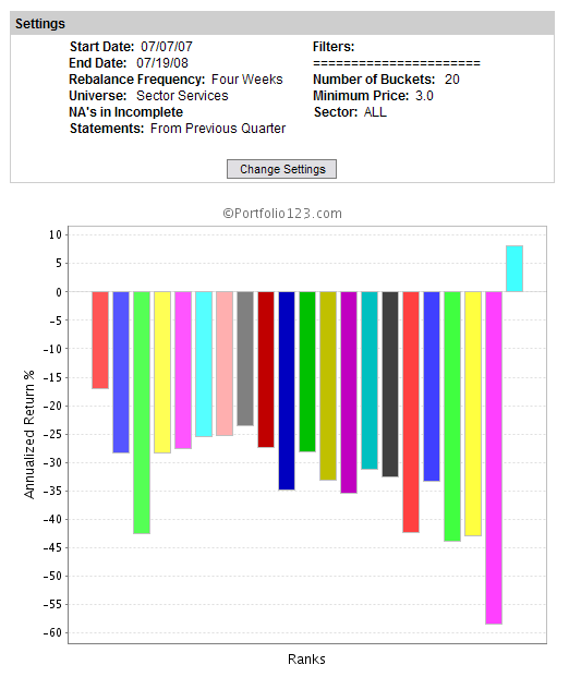
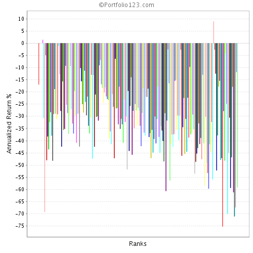
Out of curiosity I tested a P2SalesQ ranking for each sector. Not surprisingly the Financials did poorly, with a -50.1% return for the top 5%. Performance for Energy surprised me, -35.9% in the top bucket and poor performance in the low buckets as well, the high performance was in the middle of the range. I was also surprised by the pattern of performance. In several cases performance declined in the higher (lower p2sales) buckets with a significant exception in the top bucket - an example is below. There were also several cases where the return of the top bucket was exactly 0.0. Not sure what would cause this but I don’t think this is valid.
In any case, Financials returned -50.1% in the top bucket and my test of all stocks returned -52.7% in the top bucket implying that P2Sales actually did slightly worse for the market minus financials - I did not include a minimum liquidity screen nor did I exclude OTC. I can’t help but conclude that the breakdown of P2Sales is not due simply to the financials.
I’ve seen phenomena similar to this Factor Reversal issue in other contexts as well.
Those who work with the capital asset pricing model are often confronted by the instability of beta and risk premium; the problem isn’t solved through arbitrage pricing theory since most other factors that can be used also tend to be unstable. I’ve also seen trouble in this regard with efficient-frontier portfolio theory; even if you can come up with decent expected-return inputs, there’s a ton of instability in standard deviation and in correlations.
There is a branch of research relating to a topic known as “regime switching” wherein they try to objectively model the usefulness of different factors at different points in time. I haven’t seen any great results yet from this, but it sounds like it might be promising if the researchers can successfully avoid the data mining trap (a problem that seemed rampant during the time I was exposed to heavy quants).
The reason that the top bucket had a value of 0.0 is because the distribution has a (or a few) outliner stocks that have a value of price to sales significantly lower than the pack. This causes the distribution to be distorted leaving no stocks in the top bucket. If you re-run the performance of your price to sales ranking system using 200 buckets you will see one bucket with a +8% annual gain in the 97.5 rank level. All the other rank values above a rank of 94 are 0.0. See below.
The problem is caused because you didn’t use a liquidity filter on the stocks. If you use a liquidity filter as low as AvgDailyTot(60) > 10000 the problem goes away. So the problem is caused by a few very small companies. This is one of the reasons that I try to always use a liquidity filter. See below.
As Denny mentioned this problem is generally due to outliers. Instead of using the factor on its own I tend to use something like the following in my ranking systems:
eval(Pr2SalesQ > 0.2, Pr2SalesQ, NA)
A low P/S ratio is good, but an extremely low value usually indicates that there might be trouble.
I too have noticed that much of what we rely on here at Portfolio123 falls apart after July 2007 and/or October 2007.
Last year there was talk of the managed funds resorting to selling indiscriminately as the markets kept falling, so even the stocks of the most fundamentally strong companies fell, as all those funds with similar factor strategies rushed for the exit. Maybe that is what we are now seeing in our data.
The question now is whether behavior will revert to “normal” (whatever “normal” means) in the near to medium-term future. Or have we entered into a completely new landscape that will require new techniques, strategies, tools, and ways of thinking? Where would that leave us with Portfolio123?
I think one has to be very careful about a lot of the implicit assumptions made when running backtests etc.
I have noticed, for example, that a lot of technical relationships are unstable and break down after a period of time, and/or even reverse (causing crippling losses for anyone relying on them for trading).
I have also noticed that some successful strategies can go through several months of underperformance and then pick up again. This raises an interesting question, if you have an underperforming portfolio should you dump it or keep it? There are arguements to be made for doing both.
This does sound very interesting. I know that the Standard and Poors Backtester does include ranking systems (a la P123) that can have dynamic weighting - the weights change over time. Unfortunately this product is about $30k/year subscription, way out of my budget.
I am feeling that technical factors are the most vulnerable. I have seen the “mean reversion” trade change in recent months from a shorter to a medium term timescale. If you chart close(0)/sma(50) you see it shows a mean reversion trade, but in prior years it really did very little.
Fundamental factors, such as valuation, are more interesting. I have talked numerous times about the effects of “valuation compression”, whereby the gap between the high valuation and low valuation has narrowed, something that cannot continue indefinately, and therefore due for a correction. Perhaps it would be nice if P123 could display a chart showing the progress of the average P/E ratio etc. for each of the five quintiles in the market, then you could visually see compression/expansion in these ratios.
Another comment is that Warren Buffett, the worlds richest man, has achieved a long term rate of return around 24%. In light of this, it is perhaps important to ask the question, are these 50%+ rates of return seen in backtests realistic, or a mirage. Perhaps emphasis should be put on robustness rather than performance. I know it isn’t as sexy, but it may be more likely to work.
thanks for your comments. You are making valid points.
“Style drift” is a problem and it will never disappear, it is part of the markets. it is the notorious “pig cycle”. Wheenver something is working great, lots of people jump on the bandwagon. This is the nail in the coffin of that particular style (or indicator). After a while (short or long) the results start deteriorating / falling off the cliff and people give up or modify their style. Sure enough, it will start working again at some point in time. Unfortunately the time cycles of these changes cannot be predicted. It is and always will be part of the markets.
I really support your view on “robustness”. It is easy to create “incredible” results with P123 only to see them fall apart when applied to the markets under reality conditions.
Robustness is often talked about but often the lure and the seduction of high returns take over. Whenever I have the choice of GREAT but erratic returns and smaller returns but a ROBUST (smooth) equity curve, I always try to take the latter. In the end I was always glad I did.
Hi:
I totally agree Robustness is No. 1 improtance. I had few port with great back test, but total failure in real world. I would (so will lot other mumbers) appreciate any one sharing their robustness test method.
The above comments got me thinking. One of my favorite new feature that I would like to see implemented is the ability to provide the number of stocks that fulfill at a certain condition. This could look like #stocks(Prc2SalesIncDebt<1,0), which would give the #stocks fulfilling the condition at the open of bar 0.
I used the screener and downloaded the results in excel and plotted the # of stocks. What I found is that at the last rebalance of 7/14/08, there were 1152 stocks below 1. In the history of the database this is a new high. This means, in my view, that we are entering a strong buying point where value can be bought. It may be that the number of stocks continues to go up for a few more weeks/ months but we know that it will go down eventually. The lowest number of stocks was 696 and the average 942 number of stocks.
What I take out from this insight is that we need to watch the expansion / contraction of the number of stocks of our top 30 factors and than make a judgement call if they are overbought or offer great value like now.
Thanks for this, this is a fascinating graph and exactly the sort of thing that I was talking about. However, there are a couple of “gotchas” with this approach:
The number of stocks in the universe tends to increase over time, therefore, the absolute number fulfilling a certain condition is also likely to increase too, all other things being equal.
Asking how many stocks below an absolute valuation ratio doesn’t answer the question of the dispersion in valuations: It may be that the dispersion between high and low PSR has narrowed recently. I think most people would agree the market today offers considerably better value than on 03/31/01, and maybe that is the reason we see more stocks meet the screen.
I have been thinking about putting in a formal feature request to generate graphs, though I haven’t quite figured out how to word it, and also what excactly to be asking for. Definately something along the lines of fwouters graph, perhaps showing the median quintiles or something like that of each factor. Discussion appreciated!
This is a fascinating topic. Robustness is something widely sought but so far, rarely achieved. Case in point: the current financial mess where the models that imploded were created by some incredibly sophisticated mathematical minds who certainly can preach robustness while chatting over coffee but couldn’t incorporate it into their work. Clearly, the conventional measures of statistical significance do not suffice (they, like the models from which they derive) are sample specific.
The key to robustness may be a matter of understanding what exactly is happening during cyclical turns, which is where much of the factor reversal and style drift issues tend to surface. And this raises the question of whether true robustness is really possible (without driivng returns to unacceptably low levels).
If factor reversal is to be conquered, I expect it will take some sort of "regime shifting"model wherein we use objective rules/models to forecast which factors are about to become more or less relevant. I haven’t had an opportunity to research this yet (I was preparing to tackle it about a year ago at Reuters but got reassigned to another project before I was able to get it off the ground) but my initial thought is that it would be based not just on market/financial but also, and perhaps primarily, on economic data and that we’d be looking for blips or outliers in rates of change (second, or perhaps even third derivative). We may also want to model rates of change in forecast error relating to our basic models.
I don’t know if any of this makes sense; I’m just thinking out loud . . .
The number of stocks in the database was increased from about 3500 stocks to over 8000 stocks on 01/26/02. You can see this by the vertical jump in Filip’s chart at that time. This is the point that P123 added most of the Micro caps and OTC stocks. Since the value didn’t double at that time, there was probably a significant difference in the % of these additional companies with a value of Prc2SalesIncDebt < 1 than the % of the larger companies prior to 01/26/02.
So the lowest number of stocks on Filip’s chart is not the lowest number as a % of the stocks in the data base. That occurred near the end of March 2006 on Filip’s chart, about 1 year before the S&P500 peaked.
Another interesting point from Filip’s chart is that the triple highs between August 2002 and April 2003 correspond very close to the triple low of the S&P 500.