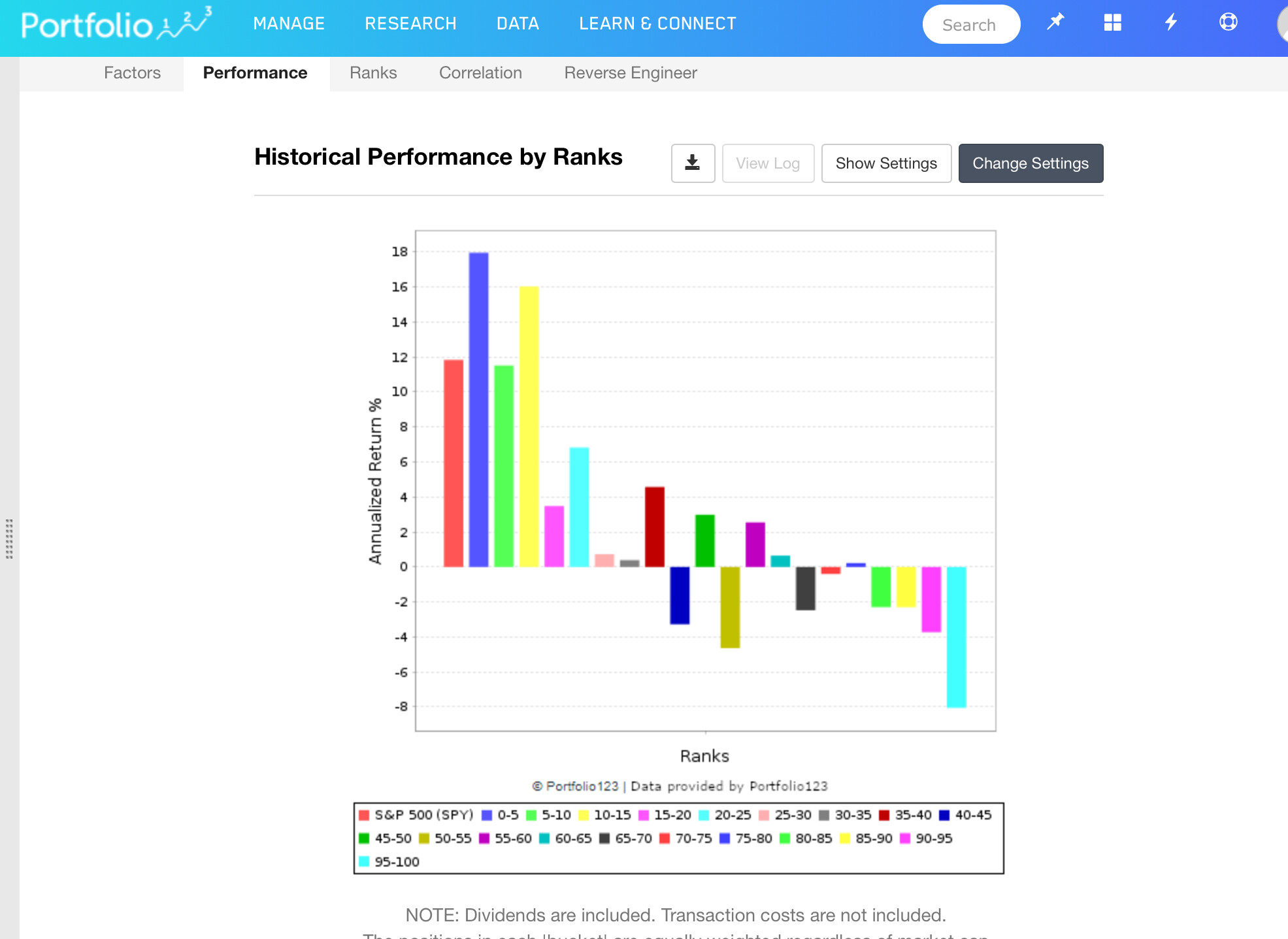
ab, re: inversion. What you’re showing is what a factor rank plot can look like if you’ve got the ranking inverted or upside down (don’t know enough to say if it is, but seems like a possibility given that plot). I think the specific arrow Yuval is referring to is the arrow at the very top folder for the ranking system. You can completely invert the ranking system by toggling that top-most arrow up and down. What Yuval is referring to is in the ranking systems there is an arrow next to the factor that shows whether an variable is ranking ascending or descending.
(If higher is “better” for a factor then you want the arrow pointing up. If higher is “worse”, then you want the error pointing down.)
Example: If you feel like lower PE are better than higher PE (not saying it is, just as an example), then lower would be better in that context and you’d want to put a down arrow next to PE so the lower PE will rate higher than higher PE.
As mentioned, an entire system can be inverted by toggling the very top arrow.
hope this helps. I also agree with setting up a custom universe to encapsulate the universe you wish to test/and or trade, constrained by exchanges and liquidity requirements. Depending on what you’re doing, All Fundamentals might have some stocks that are too small or too illiquid to be part of your potential system. For example, here’s lines from one of my base testing universes (not saying this is one to use, just giving an example because I’m concrete and prefer concrete examples, and these are main filters I use):
Universe(NOOTC) and Universe($ADR)=False and Universe(MasterLP)=False
!GICS(FINANCIAL) and !GICS(REALESTATE) //this has changed to RBICS, so maybe update this. I think it still maps though.
MedianDailyTot(63)> (200000) and MktCap > 75 and Price > 3 //this is close to what I use for liquidity but also have a scaling factor for mkt value.
IssueChange(8) = 0 and DaysLate <=5 and DaysFromMergerAnn = NA
Country(“CHN,RUS”) = False
edit: the new 2nd line might be something like
!RBICS(3010,3015,3020,302520,303010)
other folks probably have other constraints, but that’s one I use to test with. I have some other universes where I add a line for maximum liquidity to screen out the biggest companies when looking at small caps only.