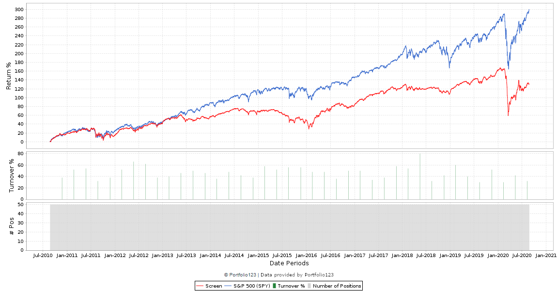
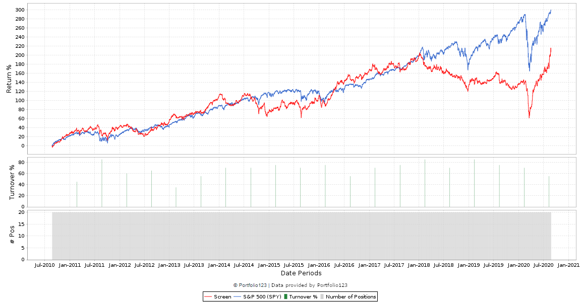
It’s not good. The top one returned over 100% since 2010, the bottom one has a loss.
For one they are buying different stocks. You can tell just by looking at the #Pos charts : they are different. Assuming it’s the same screen then the only explanation is the different starting date combined with your 3 month rebalance period (a shorter rebal freq would produce more similar results with high turnover). This is a tell tale sign of curve fitting.
On top of that the screen sometimes buys 1 stock, sometimes 20. Without a limit for “Max Pos %” you could be putting all your money in few stocks during some periods. This can cause massive differences.
Bottom line you are looking at two possible outcomes of many, with the top probably being the best possible. I would not trust a system that produces wildly different results just because of the starting date.
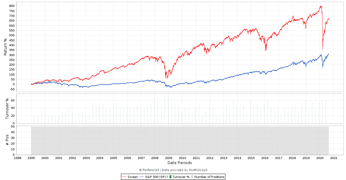
Yes, something is very much different between the 2. The most recent rebalance on the top screen shows 6 stocks. The bottom screen shows 12 stocks.
The other big problem with long rebalance points (looks like 3 months rebalance based on bars at bottom) can be illustrated with a momentum signal.
You want high momentum stocks. You rebalance every 3 months. Your momentum signal is something like a trailing 6 or 9 months return.
One screen may rebalance one week into a market shock. You are holding things like high tech and super growth stocks. Your market timing signal saves you from the majority of the loss. You buy back in 3 months later and are holding quasi-momentum stocks which are bouncing back good.
A second screen rebalances after the market shock and then goes to cash. You get 100% of the downside capture while holding ‘risky’ stocks (i.e. they were high momentum and had a long way to fall). You completely miss out on the first 3 months of the recovery period. When you do finally rebalance, you are holding defensive stocks (stocks with the highest relative strength after a crash are typically low volatility stocks).
The short answer is that 3 months can mean the difference between a 10% or a 50% drawdown. Having too few stocks is like adding in a 2x multipler on this. And the time span of 3 months can also mean the difference of holding ‘high momentum’ staples/utilities/etc. after a crash or high-growth stocks before the crash.
Much better to run a weekly simulation of this with something like 30 stocks and loosen the sell criteria to reduce turnover while staying nimble.
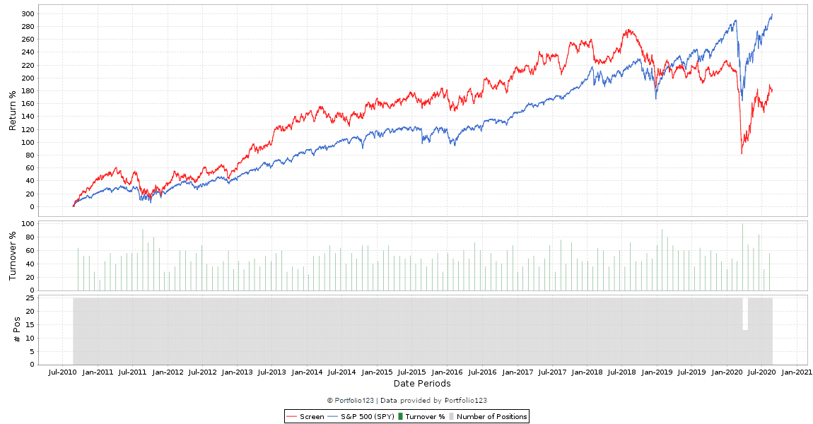
Thanks, this is a similar screen; only 1-2 rules and now with 20 CEF’s
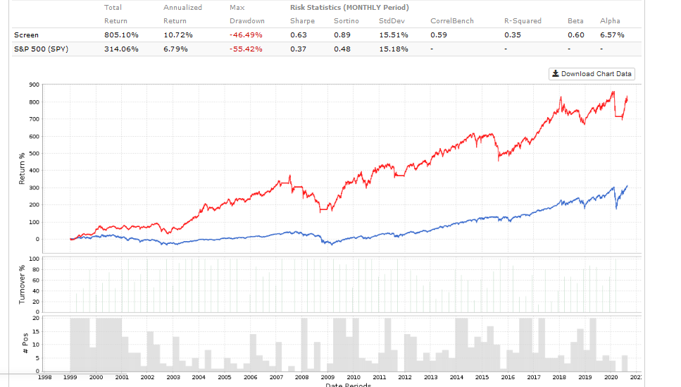
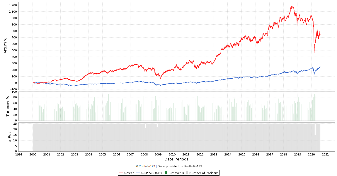
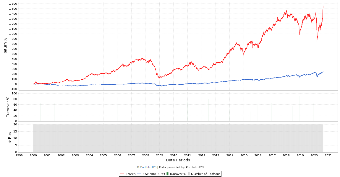
First screenshot is from 2000-2020 as before
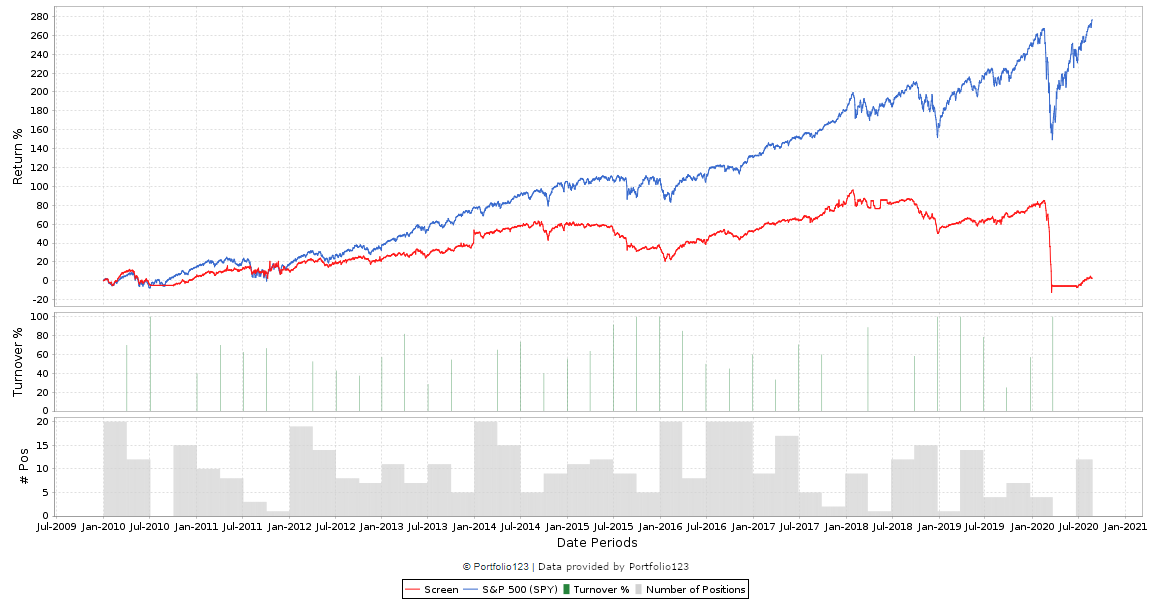
Second is from 2010 to 2020.
There is nothing different other than the start dates (it is quarterly rebalanced, same slippage etc.) - I am finding the same with a bunch of different strategies - this is on CEF’s, but stocks is often the same - and these are very simple - 1 or 2 rule screens.
I just think how can the % gains/losses between the two be so different; surely its buying the same 20 CEF’s so it should be consistent.
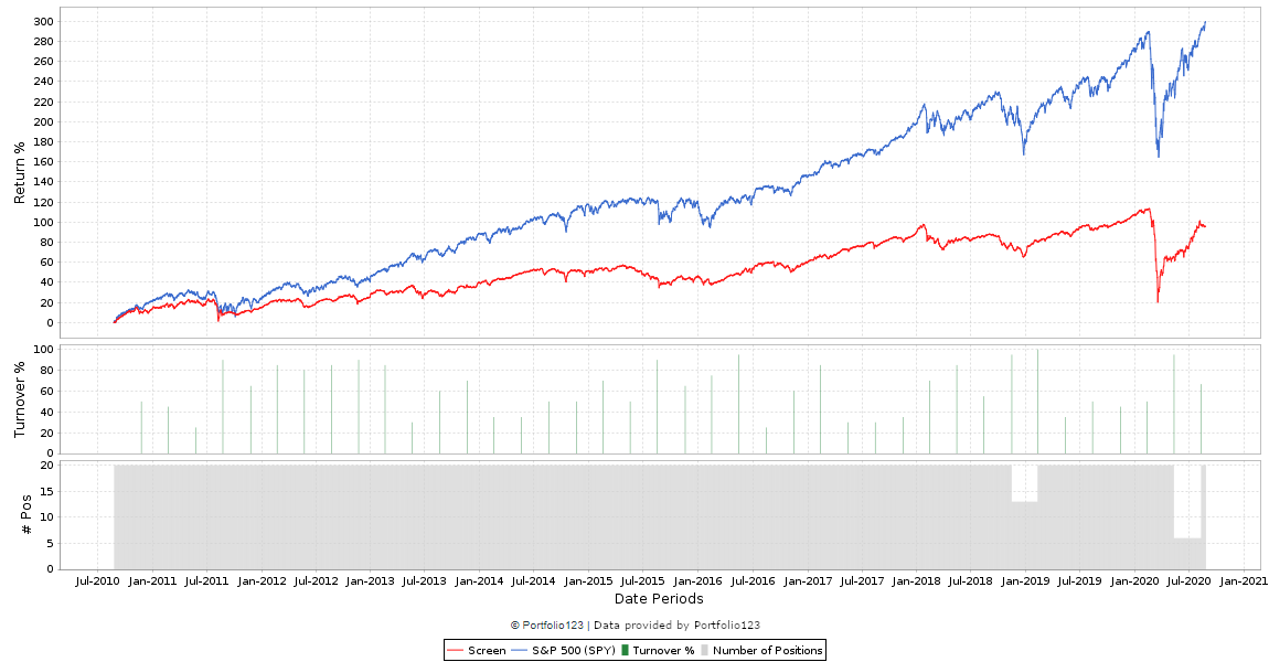
Now - literally, no rules, 50 CEF’s and only a sorting mechanism so highly unlikely there is curve fitting - only difference between image 1 and 2 before is image 1 is 2000-2020 and second is 2010 to 2020
From the middle of 2010 to now, the model (in the 1999-2020 plot) goes from 300% to 650% => roughly one doubling, or 100%. Which is what the 2010-2020 plot shows. I think this looks ok, or am I wrong?
The returns went more 300% to 1200% in image 1; however look at image 2; its showing a 1.5x return - if that were the case, should it not be showing at least a 4x return from 2010 to 2020?
Make sure that your rebalance dates line up. If you are going to run a simulation from Jan 1999 in one instance, then you need to start it on Dec 12, 2009 or March 20, 2010. If you pick any other date (using 3 month rebalancing), all your are showing us is that the factors you are selecting are not robust and highly dependent on fluke timing. It cannot be a critique against P123.
If you want to see the difference that timing makes, run a rolling test in the simulator. This will show you exactly the difference your strategy makes when you select a different starting date. You can set the test to start a new portfolio every week and hold for 3 months. If there is a high degree of variability - your strategy is not robust and more likely a fluke. Another simple way to test your strategy is to just keep moving the start date forward by 1 week and re-run. Do that 12 or 13 times and see the difference in return profile.
In your above images - there is a 220% return over the past 10 years. So if you start with $100 you now have $320. 12.3% CAGR
In the image with the entire history, you start with 300% return and this exceeds 1,550% return. $400 to $1,650. 15.2% CAGR
3% CAGR difference in return. And I can tell you that for sure they are not picking the same funds. The shape from 2018 to current doesn’t look the same in the two.
If you want to reduce the effect of fluke timing - do the following:
run a rolling test and look at the different return profiles based on entry date
reduce time between rebalance. It can mean the difference of accidentally sitting out a bear market or sitting out the recovery period. Huge difference.
Use simulator instead of screener to separate the buy and sell rules. This lets you slow down turnover with sacrificing too much timeliness.
Use price and liquidity filters. You will have more variation if you include illiquid stocks trading in the penny range.
make sure your factor matches up with the rebalance period. If you trade based on 1 week earnings revisions, you shouldn’t be rebalancing 4 times a year. Faster moving factors require shorter rebalance periods.
Run factor backtests to make sure the selected factors are meaningful. A factor with zero forecasting ability will likely generate random results.
*include more stocks/ETFs. Start with a big number like 50 or 100. If you start by designing systems around 5, 10 or 20 stocks, you are more likely to curve fit based on a few outliers.
In a nutshell, the maths are correct. If you want a more consistent result with long rebalance periods, you should apply the above points. To test out the maths - make sure the rebalance points match up perfectly. Use March 20, 2010 as your start point if trying to match up performance with a sim that starts in Jan 99 and uses 3 month rebalance points.
The short answer is that the start date can make all the difference in the world — if the model is not robust.
Do a search for the “Butterfly effect” in chaos theory. Small changes can have a non-linear impact that is exacerbated as time passes, particularly in systems with geometric growth (such as the investment markets we work with here).
To determine if a system is robust, quantitative investors should set up Robustness-test runs with a plethora of start dates. If the results change dramatically from one to the other, you don’t have a robust system.