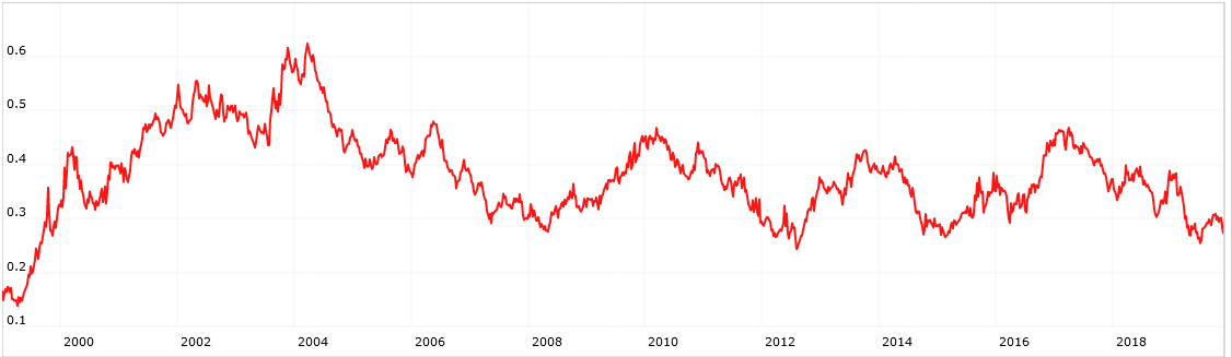
I tried this as a series. The rule is univcnt(“close(0)/close(252) > close(0,#bench)/close(252,#bench)”)/univcnt(“1=1”) The universe is All Stocks and the benchmark is the S&P 500. Here’s what I got. So it looks like we were in this same situation (only 30% of stocks or fewer beat the S&P) several times before: throughout 1999; April 2008; August 2012; March 2015. Here’s the chart.
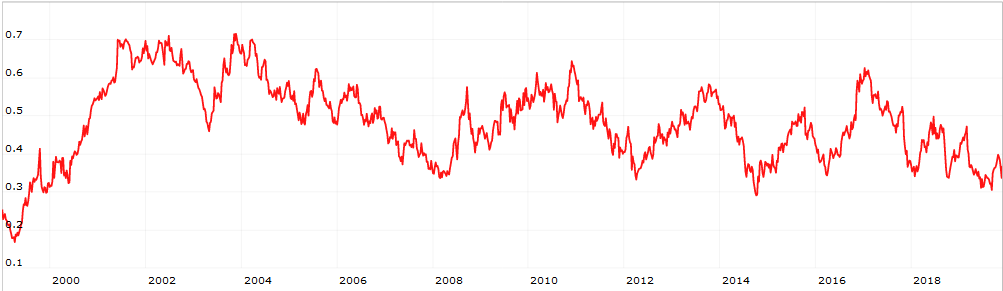
Here’s a chart of what I call the “Liquid 1700” (S&P 1500, Nasdaq 100, Russell 1000). This is a comparison of 2-year performance vs. the benchmark.
Only 35% of the Liquid 1700 has outperformed SPY over the last 2 years. The lowest level since 2000.
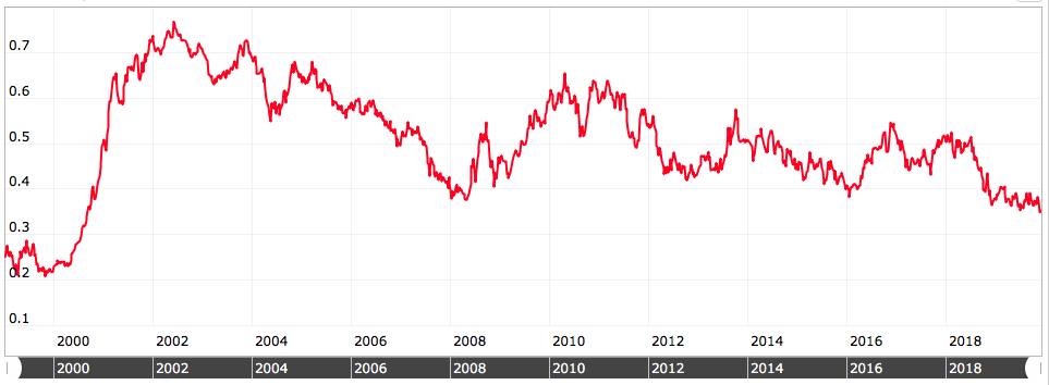
I looked at the S&P 100, and 61% have outperformed SPY over the last 2 years.
I am afraid that what it’s going to take to reverse this trend is a lot of selling of index funds & ETFs, i.e. a bear market. In other words, a repeat of ~2001 - a bear market where many stocks are up while the megacaps bring the indexes down…
Be careful about sampling and naive reliance on the full-blown random sample.
For an exercise like this to mean anything, it would have to be framed as close(0)/close(252) among the kinds of stocks active managers tend to favor divided by close(0)/close(252) for the market assuming one satisfactorily justifies What definition of market is chosen all adjusted for the investor/manager’s target level of risk.
For the Liquid 1700, only 30% of stocks with Beta3Y > 1 have outperformed SPY over the last 2 years. Compare 42% of stocks with Beta3Y < 1. To the extent active managers tend to favor stocks that move as opposed to stocks that plod along, it’s been even worse.
[quote]
It’s gotten too far in favor of cap weight. At some point, it will revert to the mean and value investing will come back in vogue.
[/quote]Exactly.
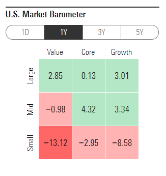
I am not sure that you said which stocks are doing well in this thread but I believe you have said larger-caps are doing better recently.
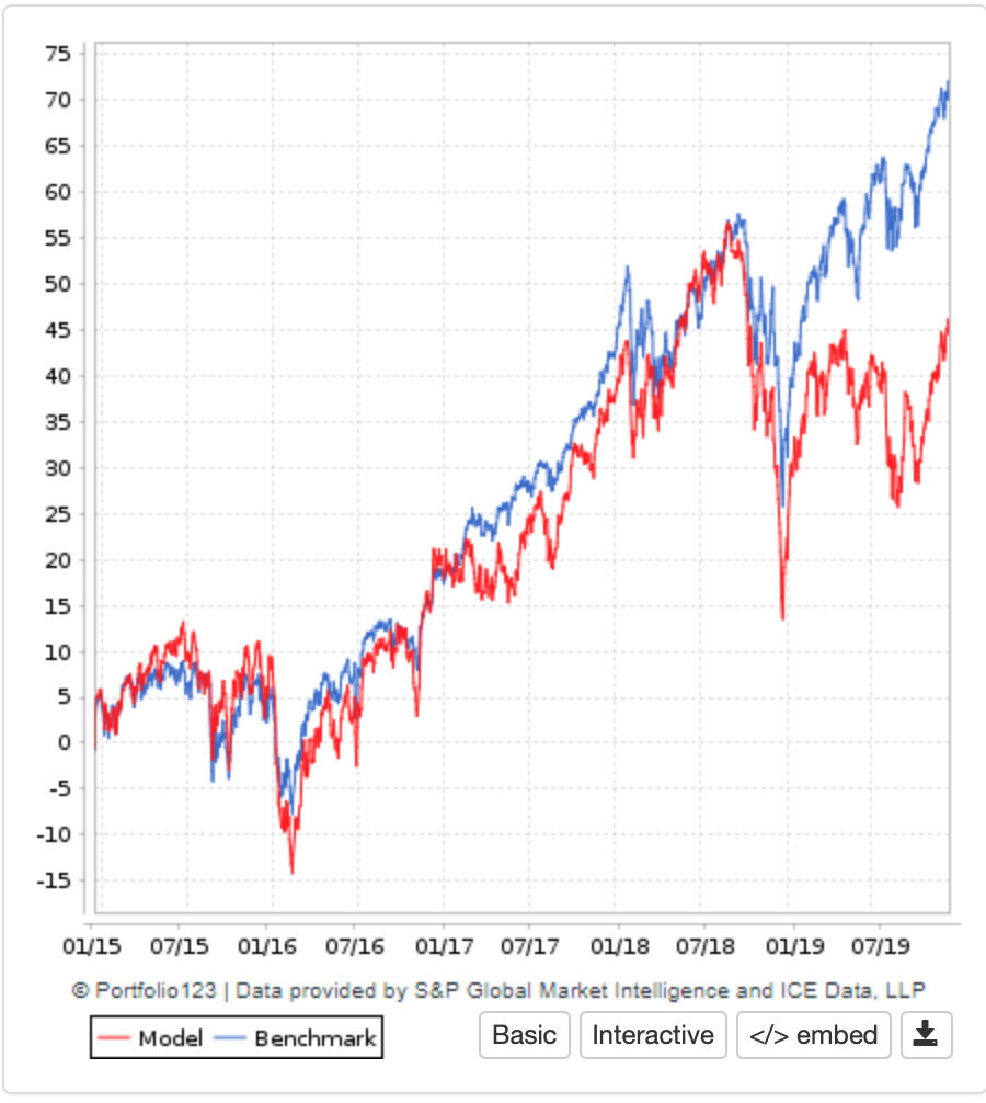
One (of many) ways to show this is with the sim below. The sim is a random selection of 100 stocks from the cap-weighted Russell 3000, rebalanced every 3 weeks. No slippage.
As you would expect the random selection tracks the benchmark nicely. That is until September 2018 when it begins to underperform dramatically which is strong support for what you say, I believe.
It does not matter how many times the sim is run, the underperformance begins then.
Something you already knew. And I believe others have shown this in different ways. For some reason this convinces me.
Evidence obviously shows that the largest market cap stocks have outperformed for a significant period and it would be very helpful to know if something in the fundamental data other than market cap is correlated, such as PEG or yield or EV or effective tax rate or debt or whatever. Lots of possibilities exist.
I am attempting to visually measure differences such as PEG over time between the largest 100 and the smallest 100 market cap stocks in the S&P500. To that end, I have universes defined for the subsets and can create custom series for the factors I want to compare. But I have found no way, for instance, to compute the ratio or difference of series which are based on different universes. I can create a Multi Chart with the series separately plotted but haven’t found a way to combine the series or download their values. Am I overlooking a method?
Large stocks did well from Nov 2018-Nov 2019. Small stocks have been in a bounce over the past month. The pictured ranking test shows a ranking system that has a single factor; MktCap. Large is “better”. The first image is Nov-2018-Nov-2019. The second is the most recent month.