I had previously promised some tutorials on charting, and this post seems to be a ‘teachable moment’ for Entry and Exit signals, so here is a tidbit of Charting Basics related to the recent violent selloff and how you could have avoided it:
While the primary focus of P123 is working with fundamentals, investors can add some essential, supplemental charting techniques to identify favorable times to exit and good times to enter. Along with the identification of desirable conditions with regard to individual positions, you can dramatically improve performance while decreasing drawdowns with every equity you buy. I avoid discretionary decisions as much as humanly possible, so I supplement my P123 picks by using charts with a strict, rules-based approach.
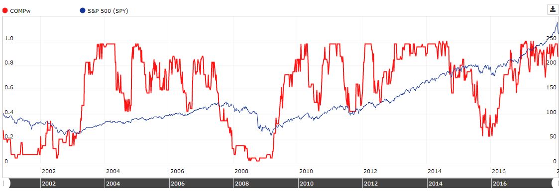
First of all, conditions were extremely overextended the week ending January 26 - in fact, the most overextended in the history of the stock market! How can I know and measure this? By reviewing a chart. This chart does not go back to 1925 (the start of the S&P 500) because you would not be able to see the recent peak, but trust me that the recent high of the market coincided with the all-time high in Relative Strength:

RSI(100) shows the 100-day relative strength of the market. As shown in the next chart, 100-day moving average - or preferably the 20-week moving average - is the key to the market, not the 20-day, 50-day or 200-day moving averages. I strongly recommend Weekly charts over noisy Daily charts.
The market used to be a far more slow-moving machine than it is in today’s computer-driven times. Investors used monthly and occasionally weekly charts when I started in the 1970s. The 20, 50, and 200-period averages were originally applied to weekly charts, then borrowed for daily charts as trading became more frequent. Of course, indicators and prices are ‘scalable’ in that an indicator that works on a monthly chart will also work on a five-minute chart. However, the shorter the time segments you observe, the more likely it is you will see a lot of meaningless noise that can lead you astray. With most P123 portfolios rebalanced on a weekly basis, the weekly chart is probably all you ever need to see.
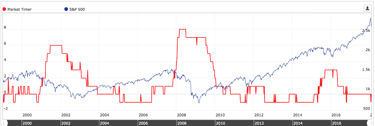
The following chart offers some rules that would have signaled you to exit the market (as I did with my aggressive-equity portfolios) at the beginning of last week (January 29), thereby avoiding all the recent turbulence. A good re-entry point is coming soon, as identified in Rule number 4:

The bottom line from my review of these charts is that in a frenzy over the recent tax cuts, the market went into a near-parabolic pattern during January. After reaching extremely overextended levels the week ending January 26, the recent selloff neutralized that situation, and it will soon be time to make new purchases (per rule #4). With economic conditions still favorable according to many measures (and confirmed by Georg, Walter and Matt’s indicators) and S&P prices above the critical 20-week moving average, the bull market is intact, and a good entry point for new positions will likely be later this week or Monday (after RSI reverses and rises above 30).
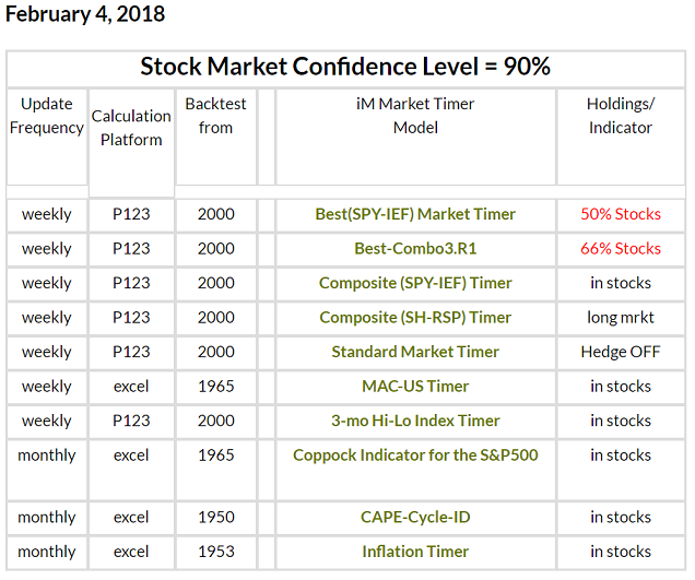
While I still check the charts visually each week, perhaps more out of habit than anything else, many of the indicators mentioned above for prime entry and exits can be programmed into P123 algorithms.
/ Chris