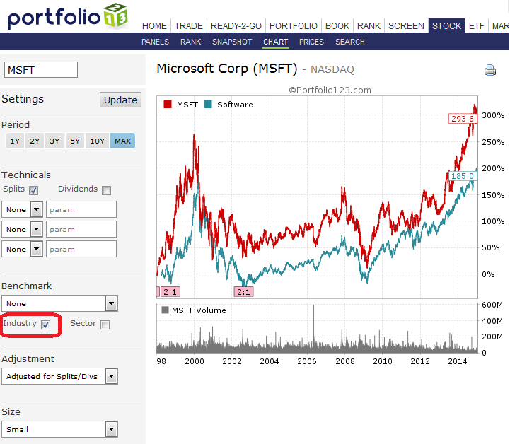
We released a new Stock Chart to showcase our custom built benchmarks. Every benchmark starts at 100 around April of 1998. We will post a full description soon on our methodology for these benchmarks.
Cheers.
FOR STOCKS
We constructed our own time series for every Sector & Industry. We calculate the benchmarks daily changes with a market cap weight.
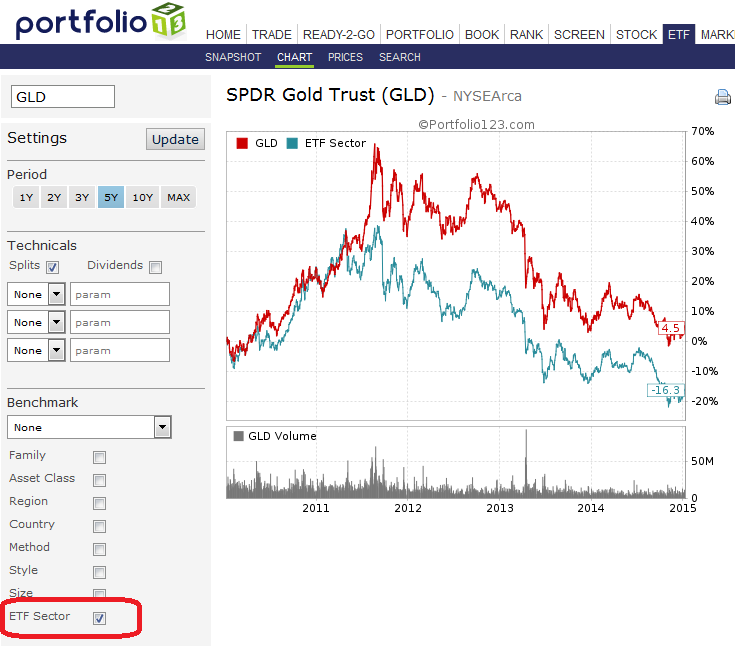
FOR ETFs
We constructed our own time series for our eight ETF classifications: Family, Asset Class, Region, Method, Style, Size & Sector. We calculate the benchmarks daily changes by equally weighting the ETFs.
Interactive charts weren’t performing well when larger data sets were involved.
Using static images for stock charts eliminates any slowness on the client-side.
There are plans to tweak the period selector to provide additional and custom ranges.
Yes, interactive charts was slow, but I suppose it was mostly because of constant updating. Current new version is OK, first select all the params, then press update button. This routine could work with interactive charts as well. Just my 2 cnts.
Period tweaks are very welcome.
BTW would be nice to have personal chart setting saved at least for session.